Annual Payroll Distribution Across NCT Region (Interactive by Year)
Summary
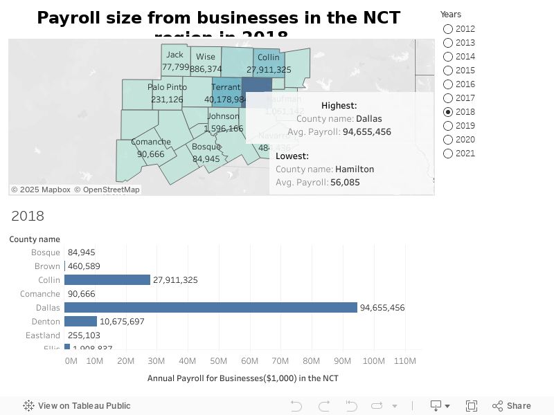
This interactive dashboard displays the annual payroll distribution for businesses across all counties in the North Central Texas (NCT) region, with the flexibility to view data by year using the year filter. Users can dynamically switch between years (2012–2021) to analyze payroll trends over time and compare county-level payroll contributions for different periods.
Key Highlights:
- The geographic heatmap provides a visual representation of payroll concentration across counties, with darker shades indicating higher payroll totals.
- The bar chart below complements the map, offering a precise numeric breakdown of payroll sizes in each county.
- Dallas County consistently shows the highest payroll figures (e.g., $110,554,872 in 2021), emphasizing its role as the region’s economic hub.
- Counties like Hamilton and Bosque reflect the smallest payroll contributions, indicating areas with smaller business presence.
- The year filter on the right side allows users to effortlessly switch between years to observe payroll growth patterns and economic shifts over the past decade.
Usage & Impact:
- The dashboard is a valuable resource for economic development authorities, policymakers, financial analysts, and business investors.
- It supports decision-making in regional planning, workforce development, and funding allocation by clearly highlighting payroll growth and disparity across counties.
- Year-over-year comparisons enable the identification of emerging business hubs or regions needing investment.